Turning a complex framing tool into a guided mobile flow.
Reimagined the desktop framing experience as a mobile-first, step-by-step flow that reduces cognitive load and increases confidence, driving higher AOV, conversion, and profitability.
ART.COM / MOBILE CUSTOMIZATION
+15.2%
net profit per visit
+ 14.9%
average order value
+38%
framed service rate
THE CUSTOMER PROBLEM
Desktop power
Monile frustration.
The desktop experience offered a fully customizable framing studio, while mobile users were limited to pre-designed options with no way to customize their frames.
RESEARCH SIGNALS OF THE MOBILE EXPERIENCE
The mobile web experience offered only a limited selection of recommended frames, negatively affecting the customer experience.
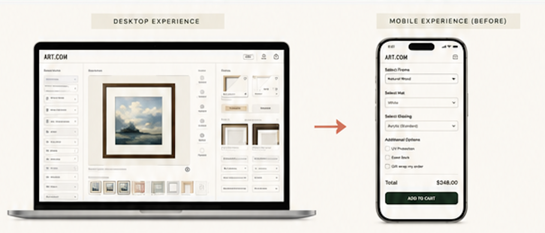
The mobile experience had high drop-off rates during configuration, suggesting customers found it difficult to complete their selections and proceed with their purchase.
Users wanted a mobile custom-framing experience with clear visual guidance at every step.
“How might we transform the current desktop-only Custom Frame Studio into a modern, scalable, and responsive platform that enhances user experience, improves usability, and supports business growth?”
— PROJECT OVERVIEW
DEISGN PRINCIPLE
Turn one dense configuration tool into a sequence of confident decisions.
Transform a complex framing process into a clear, guided mobile experience that helps users make one decision at a time with confidence.
RELEASE SCOPE
Focus on the first release.
Build the foundation.
Core framing flow (4 steps)
Top frame styles and mats
Standard glazing options
Review and add to cart
Advance options (phase 2)
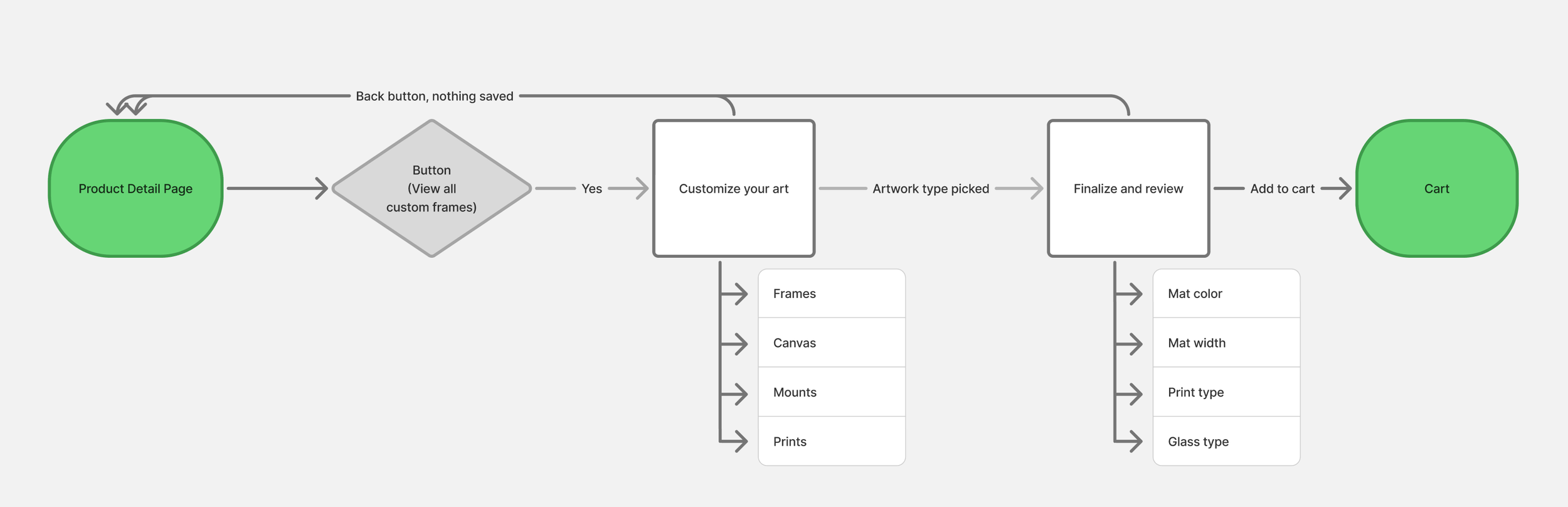
JOURNEY MAP
30+ designers
Co-created concepts across the design organization.
EVLOUTION: WIREFRAMES TO FINAL
Artwork → Frame → Mat + Glazing → Review
FINAL GUIDED EXPERIENCE
A guided custom frame mobile experience.
We validated a growing trend of customers shopping for frames on mobile devices. The data showed that they preferred a custom-framing studio experience, highlighting the opportunity to let users design and personalize frames directly from their phones.
IMPACT
+15.2%
net profit per visit
+ 14.9%
average order value
+38%
framed service rate
Projects research/design
discovery snapshot Sketch snippets
Stakeholder/Development walkthrough and development handoff
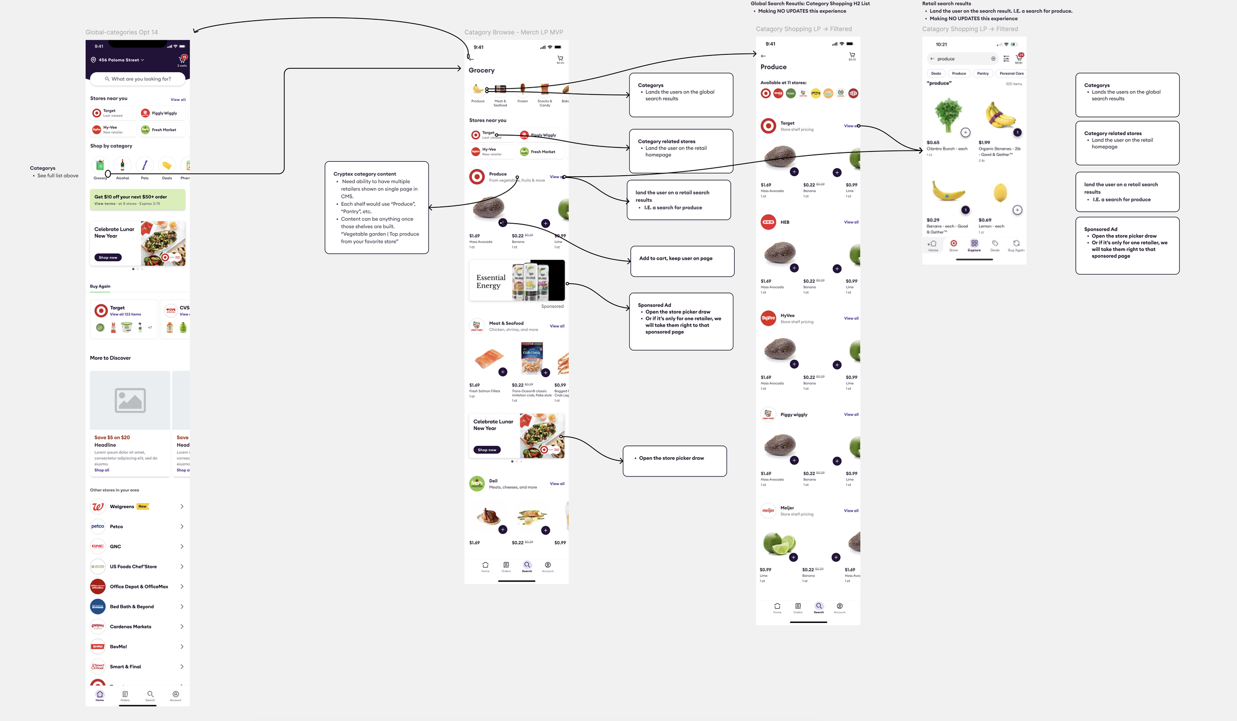
Brainstorming workshop with +30 designers, PM’s and development.
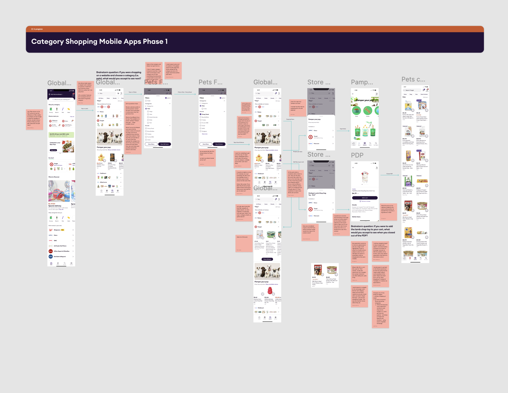
Brainstorming workshop scoring
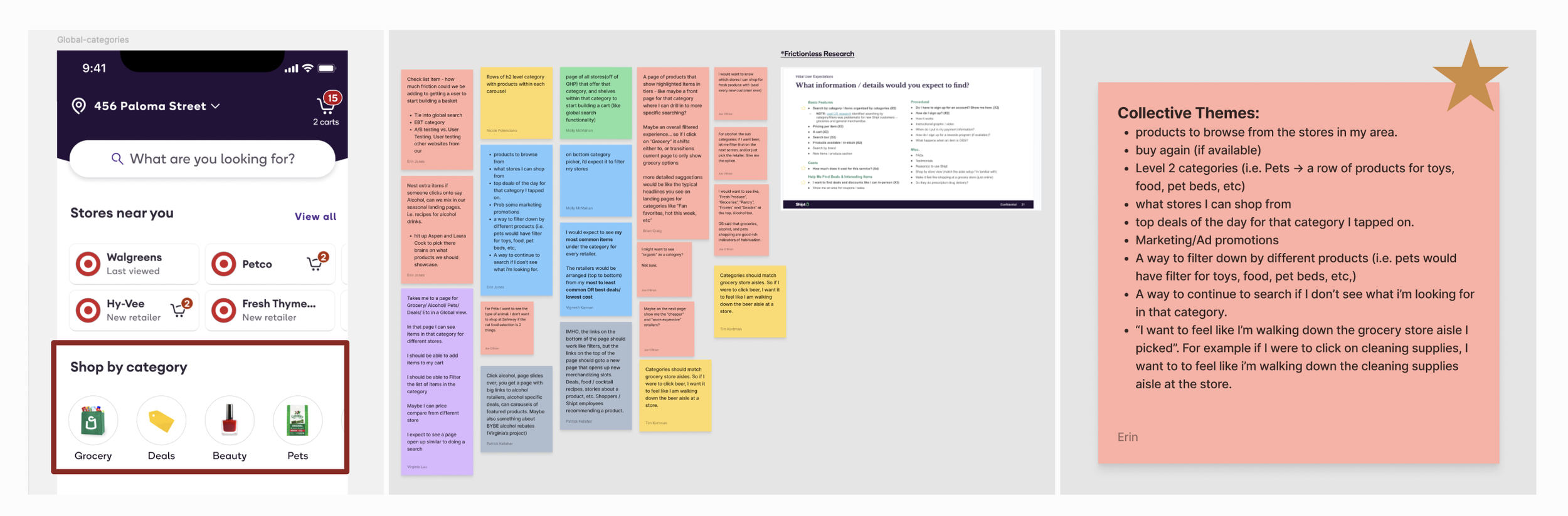
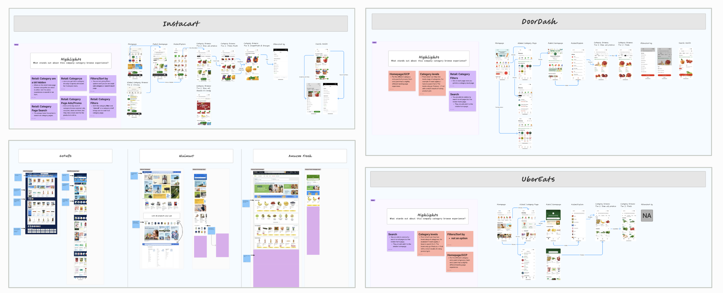
Market research
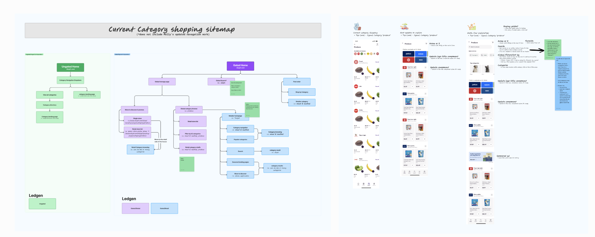
Updated sitemap for category flows
Updated design system work
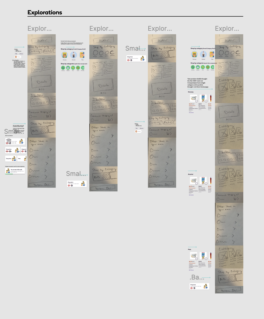
Paper sketching
What I learned
Breaking a complex customization process into clear, visual steps helped users feel more confident in their decisions. Providing real-time previews and focused choices made custom framing easier to understand while improving key business metrics.
What I’d do next
I would keep refining the experience through usability testing and behavioral data, focusing on where users hesitate or drop off. I’d also explore personalized recommendations based on artwork style, color, size, and previous selections.
What I carried forward
I would make it easier for users to compare framing combinations, revisit previous choices, and understand how each selection affects the final price. I’d also strengthen accessibility and optimize the experience across a wider range of mobile devices.
Key lessons from the project and opportunities to continue improving the custom-framing experience.
REFLECTIONS